How to Use Color Theory and Design to Make Your Food Look Irresistible
What colors should you use for your brand’s custom food wrapping paper? Make your food shine with these color theory and styling tips!
By Krystal Lam — 09 September, 2021
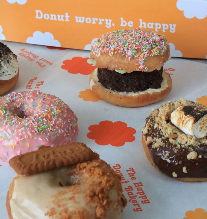
@thehappydonutco
Colors appear in much of our everyday lives and affect how we interact with the world. From website design to how we get hungry, color plays a major part in captivating our interests and stimulating our senses. 🍭
Color theory is the collection of best practices in communicating to customers through appealing color schemes, and explains why particular colors attract our attention.
🌈 The wonderful world of color

Color theory has long been used in marketing to subtly create certain feelings in customers that a brand wants to associate with their products or environment.
Colors affect our moods and states of mind even when we’re not aware of them. Different colors can cause us to become happy, comforted, or dissatisfied – so as a hospitality business, it’s important to use color strategically in food packaging since they intensify these feelings. By following color theory, we can see why many restaurants stray away from overusing purples or greys, as these colors can cause you to lose your appetite.
😋 Can colors make us hungry?
Scientifically speaking, yes! Our brains often ascertain different colors to different meanings. For example, the color red can invoke feelings of romance or passion – and appetite!
Curious as to what colors you should use for your brand’s biodegradable plastic wrap alternative? We’re here to help break down all things color theory and styling so you can make your food shine on beautiful food wrapping paper!
🎨 Let’s get down to (colorful) business
Put your best baker’s dozen forward with eco-friendly and colorful food packaging that’s also visually appealing and complements your products!
noissue Food Wrapping Paper packaging is fully compostable, so your customers can chow down without harming the planet. Your custom design can include up to two Pantone colors (white doesn’t count as a color), which is printed on FSC-certified paper using water-based foodsafe inks. Choose from either a white or kraft background for your design, and blow your customers away with your custom food wrapping paper!
To deliver your delectable dishes with perfect presentation, start by considering what collection of colors you’d want to use to make your products pop – and what feelings these tones will evoke in your customers.
🔥 Create a warm welcome
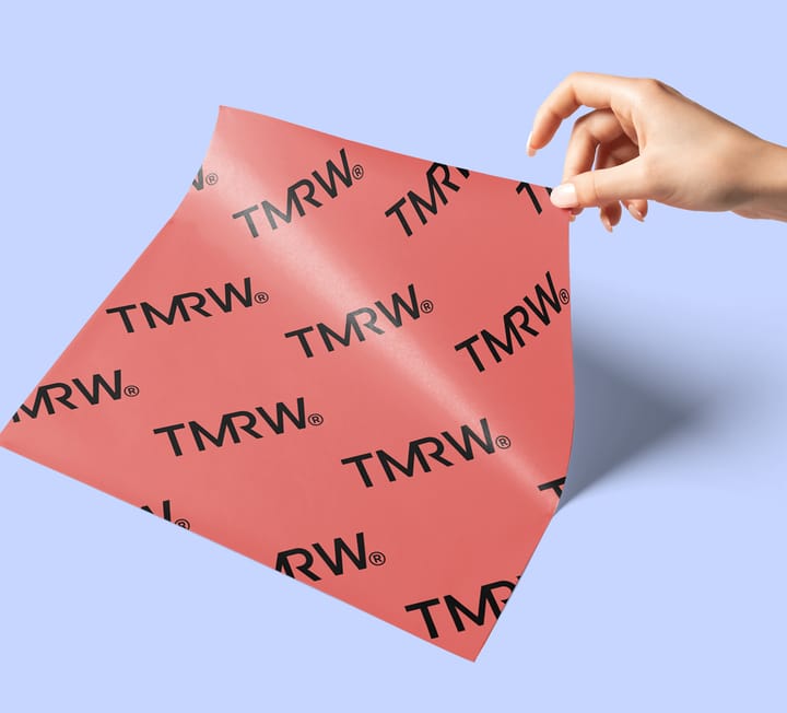
Restaurants and fast-food chains steer toward warmer tones in their packaging designs for that reason, as they tend to make food look more appealing. It’s common to see tones of red, orange, and yellow used by hospitality businesses to provide a welcoming, inviting mood for their customers.
❄️ Or keep it cool
Utilizing cooler tones can be a bit trickier, but don’t strike out your blues and greens in your food packaging design just yet. These cool tones often symbolize eco-friendliness and health consciousness, so they make an ideal backdrop for plant-based goods and healthier eats. For dreamy desserts, sweet swatches like baby blue or mint green work well!
🍞 Newly out of the oven
Brown and neutral colors add a subtle layer of something extra to food. Mimicking natural materials like parchment paper or when used sparingly on a white background, these tones can emphasize the beauty of baked goods.
🍙 Classic contrast
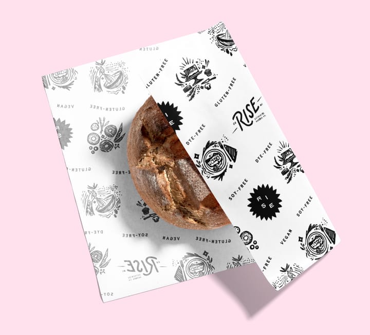
For a refined look, you can’t go wrong with the classic combination of black and white! But be careful not to overwhelm your product with a blanket of black since it could turn off the appetite if it’s the dominant color. By adding touches of white in your design to brighten things up, your backdrop will look luxurious and allow for any colorful or ornately decorated eats to steal the show.

💡 Tips for styling your food presentation
Now that you have your color theory on point, let’s dive into how you can bring out the best in your food through an excellent presentation.
Light things up
Be intentional with your lighting and what feeling you want to have at the forefront. To create a soft and calm vibe, stick to using natural light. Or, if you want a modern feel, think about spotlighting your products with a bright studio flash.
Reference the color wheel often
When you’re going with more than two colors for your setting, think about whether monochromatic or complementary colors will better fit the feeling you want your food to evoke.
Let your product do the work
Your Food Wrapping Paper designs don’t have to be super busy to capture the eye! Instead, opt for more simplistic patterns or designs that bring your branding to the forefront without drawing attention away from the food.
If you want to show your brand’s personality through illustrations or designs, consider utilizing one to two colors to avoid overshadowing your product.
Don’t be afraid to be extra!
Depending on what feeling you’re going for, add luxurious items to set the scene like tall candlesticks, or give dimension to your product with textured plates or fabrics.
🎁 Wrapping it up
So there you have it! Remember these main principles of color theory and styling to guide how your hospitality business presents your products. Make mouths water with your unbeatable bites, and serve them up colorful custom Food Wrapping Paper packaging to keep customers coming back for more!
If you’re a hospitality business wanting to spice up your food packaging, be sure to check out our eco-friendly packaging options! From customizable Food-Grade paper to personalized Tape and Stickers, noissue is here to help your product presentation cross the finish line with flying colors.
See what our noissue Bites community gets up to on Instagram, and give us a follow on Facebook and Pinterest for more inspiration and tips!